Techniques of Data Visualization: from Charts to Storytelling
A guide to data visualization and some of its core principles

Data scientist. I write about data science, machine learning and analytics. I also write about career and productivity tips to help you thrive in the field.
It’s rare to find someone good at effectively communicating the meaning of data.
On social media, I often see charts that look beautiful and clean and that evoke the “wow effect”, but which upon closer inspection fail to communicate the right meaning and interpretation of the underlying data.
In this case, the author of the visualization focuses on details that do not aid the understanding of what is observed, such as writing descriptive texts, repeating already known information and giving relevance to irrelevant elements.
The result is a chart full of pictorial elements, with bright colors that dominate the scene and little or no indications that help the viewer’s brain make sense of what is on the screen.
This happens because data visualization is not included in a reference framework, and there is no awareness that data visualization is an independent skill, but closely connected, to that of analyzing the data itself.
The unwary analyst, therefore, jumps directly to the data visualization phase without reflecting on the elements that increase the effectiveness of visual communication.
So we see visualizations that trick the observer of their effectiveness.
Unsurprisingly, such visualizations are also created and spread by authoritative sources working in specific industries and markets.
I often find things like this on social media, where graphic visualizations spread rapidly thanks to the use of hashtags. One can just search #dataviz on Twitter to find all kinds of charts, ranging from utter bad to very effective.
Let’s try to interpret the graph above. On the X-axis is time, so we’re looking at a time series. The Y-axis has a numerical range, but no indication of what those values are. Reading the title, we assume it is the percentage change.
There are some annotations. These highlight certain events that occurred at a specific point in time, while others identify the series. There are quite several of these and are connected to the different series to allow the observer to associate a name with each series.
We see that the series are colored by slope. This can only be understood if we read the two text boxes that identify this scenario.
Finally, we see that there is also a grouping by delta percentage, expressed through the size of the sphere at the beginning and end of each line.
Question*
Were you able to quickly understand what the visualization wants to communicate?*
Not me, as you can imagine. There are too many factors confusing my interpretation, and key elements, such as which label to associate with which series, are overlapping and therefore incomprehensible.
The fact is that such charts are created by people that either don’t take the time to fine-tune their work or are unaware of what they are doing. Throwing stuff on the screen doesn’t work when we want to present data and aid comprehension.
Of course, no one sets out to create a graph that doesn’t work. As Cole Nussbaumer Knaflic, global data viz expert and author of Storytelling with Data says
We’re not naturally good at good storytelling. We learn to understand words and numbers in school, but few have the knack for bringing these two spheres together.
Some elements of this article will use Knaflic’s material as examples, as they are reliable and clear.
Becoming aware of some visual communication principles becomes fundamental for the professional who works with data. In this article, my goal will be to share with you some techniques and notions to improve visual communication and to offer examples and use cases. We will see
What makes a chart ineffective and how to fix these errors
How to choose the best visualization for the available data format
Targeting and customized presentations for our audience
A framework for ensuring the effectiveness of visualization and presentation
It will be quite a long read — I suggest you grab a cup of coffee and get comfortable ☕️
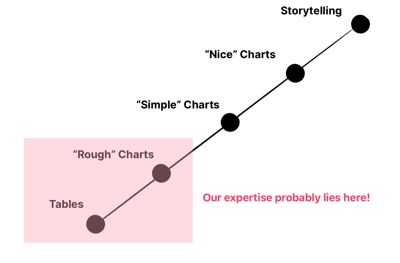
Raising awareness: Where does our expertise lie?
As in all things that involve a change of perspective, becoming aware of our current situation is the first step in achieving the goal.
It, therefore, becomes important to establish where our level of expertise in creating effective visualizations lies.
We will use a fictitious scale that represents the starting point and the ending point to which we aspire.
Levels of expertise
Let’s create a reference benchmark. By placing the skill of storytelling with data as the highest point on the scale and that of working with data in its most basic form, a table, as the lowest point, we draw a ladder that will guide us through the learning path.
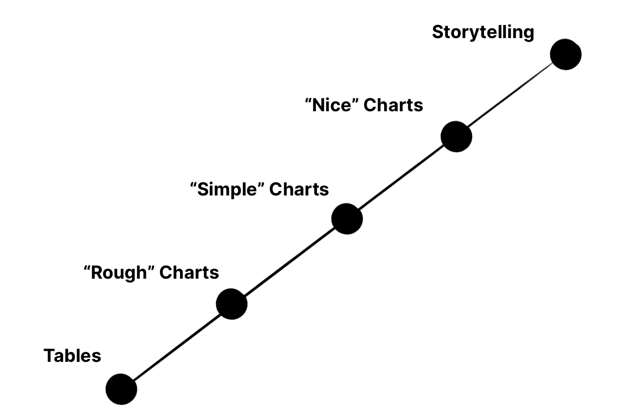
Let’s explain each of these milestones.
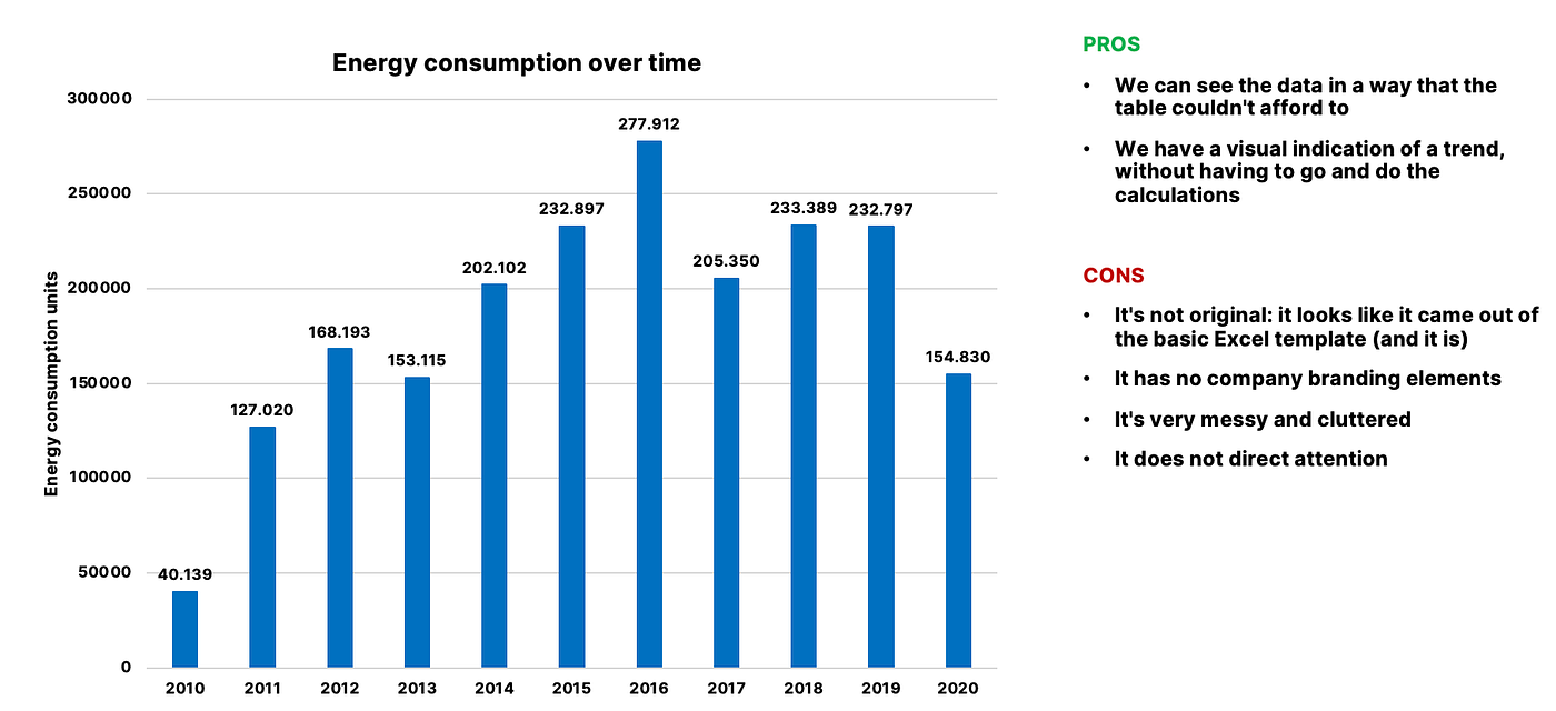
Tables We use and display data through tables, the most basic form of data visualization. Typically our tables are not formatted correctly and do not emphasize the data they contain. We use formats proposed by tools such as Excel, assuming that they are effective.
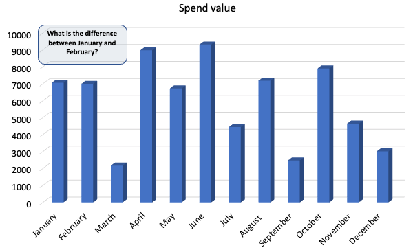
“Rough” charts We create charts that are afflicted with many problems, but we don’t realize it. We format each element of the chart, such as title, legend, labels and other shapes thinking that by doing so we highlight these features and help to understand. Disorder reigns supreme.
We use non-optimal visualizations for the data we want to show and we use long explanatory texts.
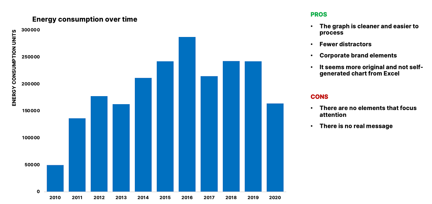
“Simple” graphs We understand that less is more. We appreciate a clean and simple layout and do without the compulsions that often and willingly lead us to exaggerate. The texts are short because the meaning of the data stands out more from the visualization.
We begin to have an understanding of the perceptual principles that help focus the observer’s attention and we are aware that each element adds cognitive load.
“Nice” graphs We can create high-quality, easy-to-understand visualizations. They are clear and effective for both the expert and the observer unfamiliar with the data.
We can choose the best visualization, giving priority to elements that exploit the functioning of human attention and direct it toward the most relevant information we want to convey.

Storytelling
Knowing how to do storytelling with data is the pinnacle of visual communication skills. Storytelling means knowing how to effectively communicate the message and guiding the narrative through visualizations.
By narration I mean a digital presentation made for example with Powerpoint or Keynote, but sometimes it can also be done through brochures or similar.
A storytelling expert is immediately noticeable: his/her story is immediately understandable, direct, streamlined, and entertaining.
Good storytelling combines beautiful, dynamically created and ad-hoc visualizations for the audience, with verbal and interactive presentations that capture and fascinate the observers.
It’s hard to show storytelling through an image, so I refer the reader to a video by C. Knaflic presenting data at a Google conference.
Post-benchmark self-assessment
Assuming that we are all able to generate a graph using a tabular data source (for example in Excel or with a Python library such as Seaborn or Matplotlib starting from a table or a data frame), let us ask ourselves a series of questions:
what’s the best visualization I’ve created?
which is one that surely had problems but that I pretended not to see or I didn’t correct for some reason?
What is one presentation (Powerpoint, Keynote) I’ve created that I’m proud of?
I invite the reader to think about these points and to give answers, even generic ones, to these questions.
Most data visualization novices fall between knowing how to create “rough” charts and “simple” charts. This is the “zone” where there is a low level of visual communication skills and therefore there is no awareness of what makes a visualization effective.
Making “simple” graphs is not inherently complex, but consistently applying the design and psychological principles that underpin them requires study and active practice.
So, if you don’t find yourself among rough and simple graphs, congratulations! You’re part of a group of professionals who know a lot more about data visualization than is generally found online :)
Based on where we are on the line of expertise we will give priority to the techniques we will see now to improve and correct errors in our views.
What makes a chart ineffective?
The number one enemy of a visualization is clutter. This clutter isn’t necessarily about the number of elements on screen, but also about the fragmentation of style and scope. Disorder is therefore also synonymous with a lack of cohesion between one element and another.
The number one enemy of visualization is clutter.
A messy graph is by definition a graph that is difficult to process. A graph that is difficult to process is undeniably ineffective.
Here’s a formula I use to rate the effectiveness of visualization.
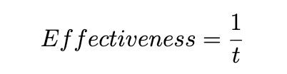
When t is large, then the effectiveness tends to 0.
A question naturally arises: what does understandable mean? In psychological terms, something is understandable according to two criteria:
we have prior knowledge that guides our understanding
the stimulus does not overload our sensory system
These two notions are fundamental for a data visualization expert: we must always think about how much knowledge the observer has with respect to what he sees on the screen and how much we overload his sensory system.
We’ll cover targeting later in the article. For now, let’s focus on the cognitive load.
Outlines of cognitive psychology: the cognitive load
In cognitive psychology, the cognitive load is a working memory space that we use to process the stimulus in “real time”. Keeping numbers in mind while repeating a nursery rhyme puts a lot of strain on our working memory.
Human attention is selective and is limited in terms of resources.
The cognitive load theory states that because short-term memory is limited, learning experiences should be designed to reduce working memory “load” in order to promote learning and understanding.
As data viz experts, we always want to consider how our representation will be mentally processed by our observer.
This is the difference between those who are good at data visualization and those who instead use it as a mere (ineffective) communication tool.
Cognitive load represents the mental effort required to process the information to which we are exposed.
It’s a bit like when we ask our computer to perform some calculations. Simple calculations will take very little time, difficult calculations will take quite a long time.
Data visualization is therefore much more than it seems — we need to be able to understand how the human brain processes information, and find the balance between stimulating the attention of the observer and overwhelming it.
Here’s the take-home message: free up the graph of elements that do not contribute to understanding — elements that increase the cognitive load unjustifiably.
Some examples:
If the X-axis is a date, it is useless to use the title for the axis itself and people inherently understand the data format
If we build a histogram, it is useless to apply labels to the bars, as a histogram is based on intervals
If the chart title is informative, there is no point in putting text that says the same thing somewhere else in the chart
If there are multiple data series, we use colors that are highly distinguishable, avoiding using gradients between contiguous colors
And so on. We will learn over time to strip the graph of irrelevant information — just ask yourself the question every time you build one.
How to create an effective visualization?
Now let’s see how to create a “nice” graph. Reducing clutter is definitely an action to always do, but there are also techniques that can increase the effectiveness of visualization.
These techniques leverage known perceptual principles, such as those of the Gestalt school of psychology. Gestalt has had a major impact by mapping visual principles that explain how humans interface with the world.
Even today these principles remain solid and to be applied to be successful in fields such as data viz.
Let’s start with the first: blank space.
Using blank space
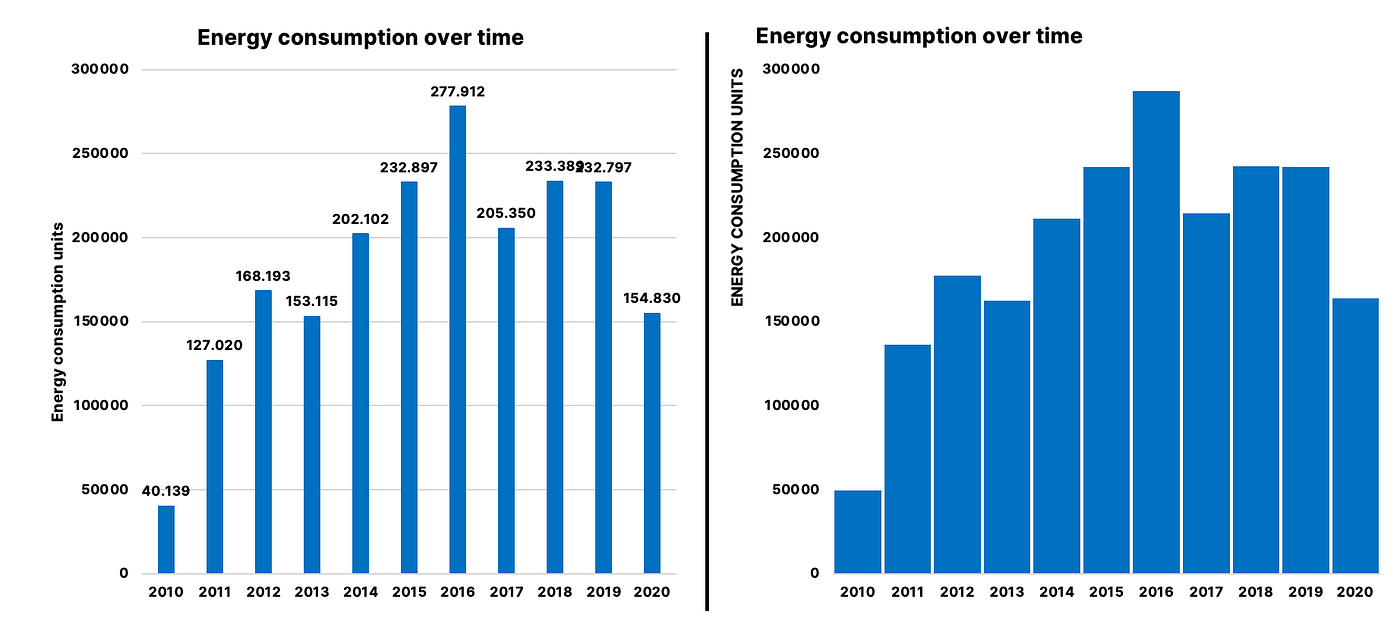
Let’s take a look at the rough and simple graphs from the previous example.
One element that should always be considered when creating a visualization stands out right away: blank space.
While the rough graph is messy and has a high cognitive load, the simple graph is “lighter”, easier to digest.
One of the elements that helps this processing is the empty space between the elements. Giving the important elements space to breathe is also a way to highlight them, without creating perceptive pressure.
In this case, it was enough just to remove the grid from the rough graph. As you can see, it’s very easy to declutter a graph if you know how to do it.
Empty space inserts a pause in the observer’s visual system and helps to stimuli processing.
It’s like a pause in a speech or a comma in a text: if there aren’t any, you will soon feel tired (excessive cognitive load) and your attention will drop more and more.
When used strategically, using blank spaces helps the audience digest our presentation and follow with a higher level of attention.
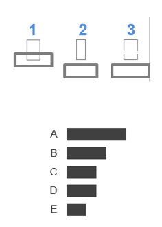
The use of contrast
A careful use of contrast will bring a simple graphic to a nice one (both aesthetically and perceptively).
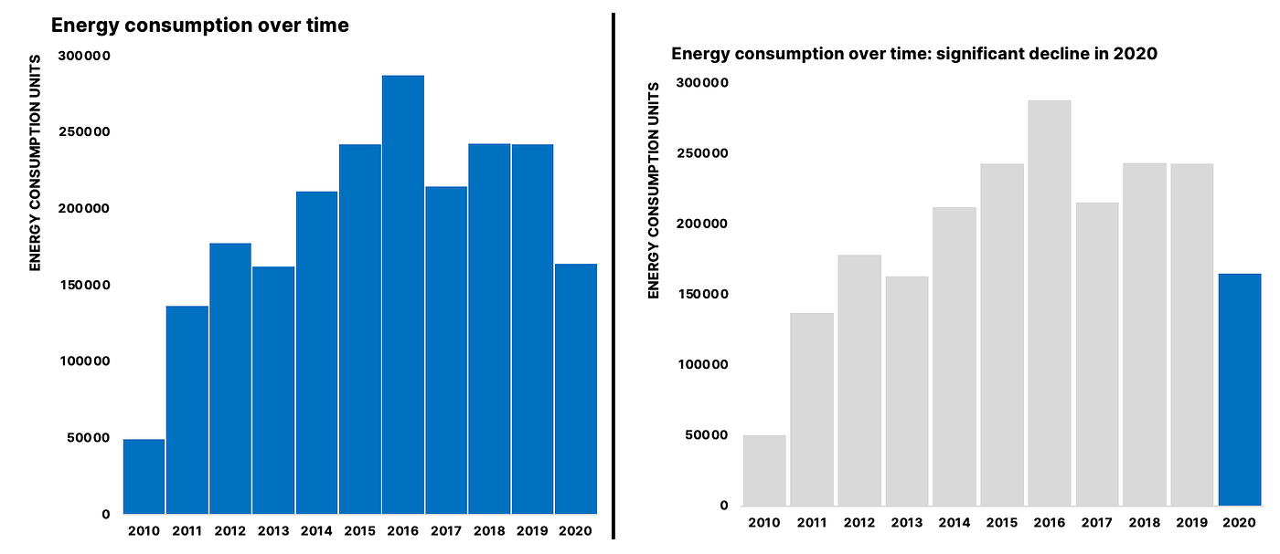
Using contrasting elements in color helps our audience focus their attention.
In fact, it’s easy to bring our eyes to the highlighted bar and it’s just as easy to ignore the gray bars.
However, we must be careful in using these techniques because it is easy to push too far and achieve the opposite effect.
In addition to the color in the example, there is also the shape: contrasting shapes attract attention. Let’s use them judiciously.
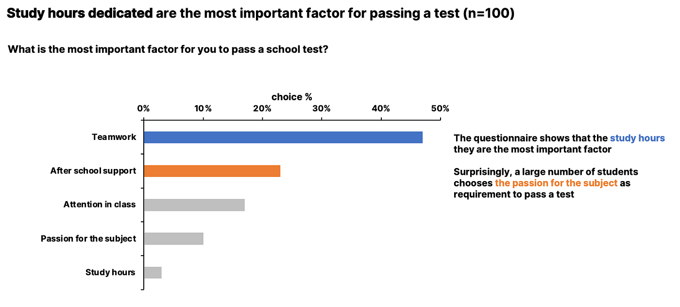
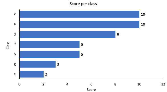
Adjusting the graph a bit according to what we’ve covered, we get something like this.
Much better.
There were several changes between the first and second graphs:
Used a horizontal bar chart because it’s the simplest and fits the situation well
A marked contrast is used to draw the observer’s attention quickly to the key point. Now we immediately know where we are strong and where we have shortcomings in relation to the other classes in the data
We have labeled the data to inform the viewer of the value of the target
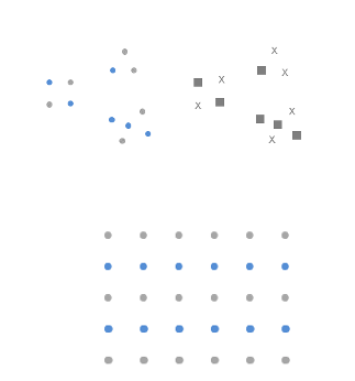
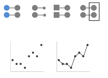
Proximity of elements
The elements of the perceptual field are united in distinct forms with greater cohesion the smaller the distance between them. Within the same environment, elements that are close to each other and similar are considered by our brain as a whole.
By staring at the black dots in the figure below, our brain does not perceive 12 equal and distinct black dots. But 3 different figures — this is because it tends to connect the dots closest to each other.

Using this principle, we can direct and anticipate where the viewer’s attention will go and manipulate their gaze.
Similarity between items
Objects that are similar in color, size, shape or orientation are perceived as belonging to the same group.
In the example image here we tend to perceive the blue circles as belonging to the same group and reciprocally for the gray squares on the right.
In the lower image instead we see how our eyes perceive two different groups based on the color of the “line”.
This helps us guide the audience’s gaze where we want.
Principle of closure
Lines that form closed figures tend to be seen as groups. Our mind is predisposed to provide the missing information to close a figure, therefore the closed margins or those that tend to join together impose themselves as a unit on the open ones.
Even very light closing effects activate this visual pattern.
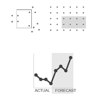
Pattern completion
Humans (especially us analysts) have a strong dislike for loose ends.
When faced with ambiguous visual stimuli, objects that can be perceived both as open (incomplete and unusual), and forms (whole and regular) are perceived as the latter.
The principle of closure states that we perceive open structures as closed, complete, and regular whenever we reasonably can.
Continuity of elements
This effect is similar to the completion principle: when we look at objects, our eyes look for the most efficient way and create continuity between “paths” that do not exist explicitly.
In the figure below, we see how removing the vertical axis does not change our perception of the graph. This is because the left alignment persists and we are able to align elements implicitly.
Connecting the dots
Objects that are physically connected are perceived as belonging to the same group.
This property is typically stronger than associations based on color, shape, or size. In fact, the figure shows how the connection continues to be dominant even in the presence of different colors, sizes and shapes.
One of the most common use cases of this principle is that of line graphs, which are based entirely on this perceptual principle.
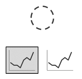
Visual hierarchy of elements
When the design of something is done well, it goes to the background and the audience isn’t generally aware of it.
But when the design is sloppy, then the audience perceives it negatively. The theme of the hierarchy of visuals is representative of this, as it is difficult to understand if we are new to what we want to expose to the public.
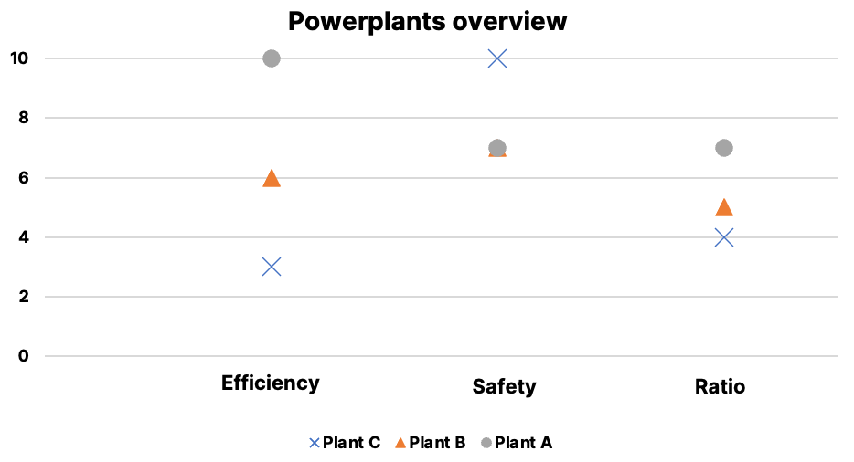
Let’s do a little exercise. Let’s consider the next image and try to compile what works and what doesn’t work compared to what we have covered so far.
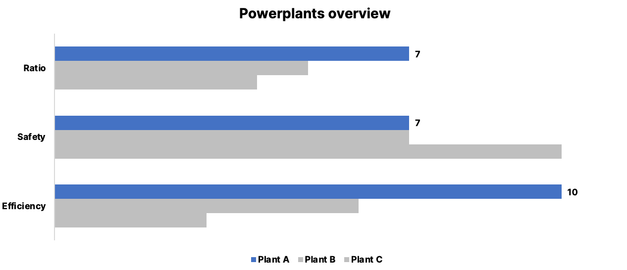
Now let’s evaluate this new, processed viz
The biggest change between the first image and the second involves alignment.
In the initial image, each block of text was center-aligned. This does not create clean lines, which impacts our perception and judgment of image quality.
We also made changes to the diagonal lines that pointed to the text. In fact, they are more difficult to follow than horizontal lines (and if these can be avoided, as in the example, even better).
Generally, the idea is to align our elements such that there is consistency and order.
Without such cues, the audience’s gaze will follow patterns similar to the “Z” pattern.
The charts that work and the ones to avoid
There are graphs that almost always work, yes.
There are also charts to avoid like the plague.
Let’s start with a list of charts that work.
Charts that work
Here is an image that contains all the graphs that work. The following image was taken from Knaflic’s Storytelling with Data, adapted with new labels and colors.

Simple text
When we have one or two numbers to display, using plain text can be a good choice.
We use a single number, make it prominent and attach a short explanatory text.
Besides being potentially misunderstood, creating a table or graph for one or two numbers can be overkill.
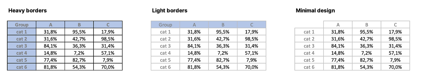
Table
The tables must be read. This is the main problem. Our eye has to scan columns and rows to find a value and this can take time and mental resources.
As mentioned at the beginning of this article, its greatest advantage is that it communicates a single value well at the intersection of two dimensions. So when we want to communicate something like this to our audience, nothing beats the table.
The design of the table is important: a light background is recommended to highlight the data in the center of the table. We don’t use thick borders or other distracting elements.
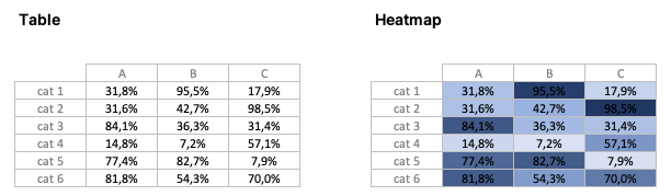
Heatmap
The heatmap fixes the problems the table has, thus removing the data reading component and using visual indications to communicate relevance of data.
It makes use of colors and contrasts to highlight values within the table, facilitating the identification of relevant patterns.
Scatterplot
The scatterplot is useful for showing the relationship between two variables.
They are very common in scientific scenarios (and therefore perhaps considered more difficult by non-experts), but they are also present in the field of business and marketing.
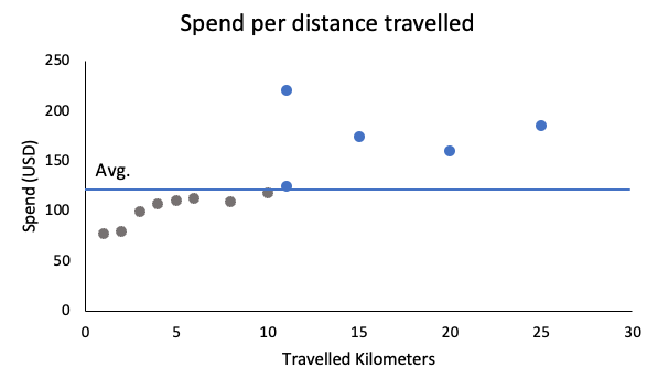
Since correlation is one of the best known and applied metrics in various scientific and non-scientific fields, using a scatterplot is effective and reliable.
Line chart
Line charts are ideal for showing continuous data (time series, repeatedly sampled data, etc.). The dots actually appear connected because they are visually connected across the line.
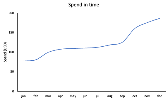
Being one of the most common graphs, it is easy to interpret and does not generate anxiety in the audience.
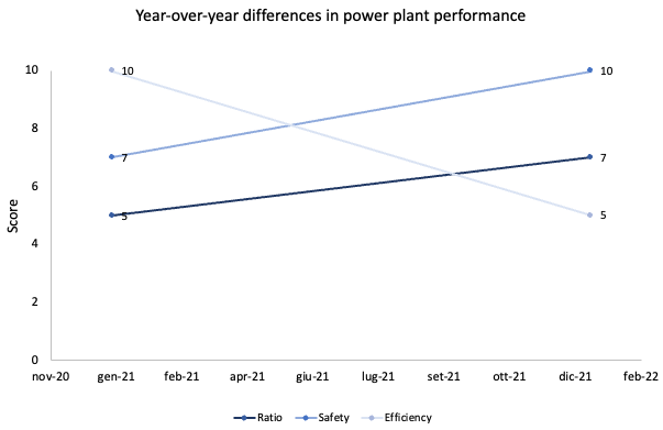
Slopegraph
Very useful for comparing periods against each other. Thanks to the slope of the line that connects the points, we are able to quickly draw conclusions about the data.
They are useful not only for understanding absolute data values, but also the relative change between the points.
Bar graph
The bar graph is probably the most common graph of all. Perhaps for this very reason we tend to avoid them for more imaginative solutions.
Rather, we should use them more precisely because they are common and leverage the public’s general understanding of how to interpret this type of graph.
Our eyes are very good at comparing the heights of two ends placed side by side. This allows us to quickly understand the increase or decrease of the data.
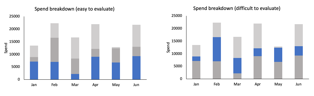
Stacked Bar Chart
The use for these graphics is more limited. They are used to compare totals across various categories and see how much a sub-category contributes to the total.
They can get messy and difficult to read quickly, so use them with caution.
A stacked bar chart can start at 0 and work its way up to the maximum raw value, or use percentages to always cover the full total.
One note: these charts are tricky to interpret when our attention is focused on the bars that don’t start at the base — that is, the ones that stack on top of them.
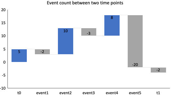
Waterfall chart
The waterfall chart is useful for breaking down the information provided by a stacked bar chart. It is useful for showing the start and end points, increments and decrements and the trend of the data.
Horizontal bar graph
This is definitely the simplest chart of all due to its great readability.
If our category names are too long, the audience can still read them simply because the data is presented from left to right.
The interpretability is promoted: in fact we will always read the name of the variable first and then its value.
Square area graph
It is not a graph to be used often, because the human eye is not very good at attributing a numerical value to an area extended between two dimensions.
It becomes useful for showing series of different magnitudes, such as a total vs its components.
The difference between an area chart and a square area chart is the arrangement of this area between the axes.
Charts that DO NOT work (to be avoided when possible)
There are charts to avoid almost always. The reasons are empirically valid: they are difficult to interpret in most cases and, despite this, they are used anyway.
The use of these graphics despite their ineffectiveness further validates the thesis of the general public’s lack of awareness of what effective visual communication is.
Pie chart
The king of ineffective charts, yet one of the most common ones. When we think of a graph, we usually think of a pie chart.
Why is it really so bad? Let’s take a look at this image.
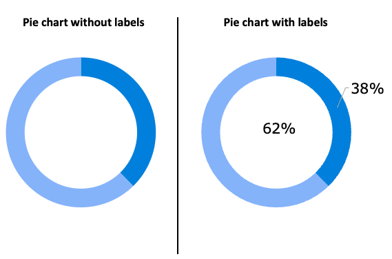
A pie chart is only really understandable thanks to textual labels. Image by author.
There are several problems:
The areas are not easily comparable with the naked eye, so each slice always requires the aid of a numerical label, which opens avenues for the use of other graphs
If two slices are similar in size, interpretation is even more difficult.
They are mainstream despite their problems — this contributes to making them hated even more
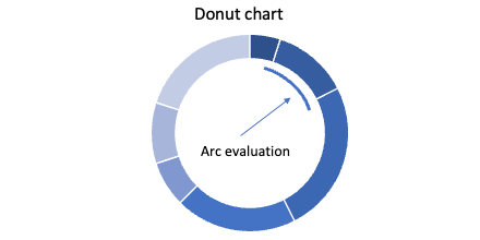
Donut charts
The donut chart has the same problems as the pie chart, only instead of asking the audience to evaluate angles and areas, here we ask them to evaluate the length of one arc against the other.
The case of 3D
One of the golden rules of date viz is never to use 3D.
Never.
The only exception is when there really is a third dimension, but even then 3D representation may not be the right way as it creates visual distortions that are difficult to interpret.
Adding 3D to our charts adds distractions without empirically offering any benefit.
The secondary axis
The secondary axis is often essential for showing a series with different units of measure or independent of the series on the primary axis.
However, it is advisable to avoid using it because it is not easy to read and the less expert observer may have difficulty if not helped in understanding.
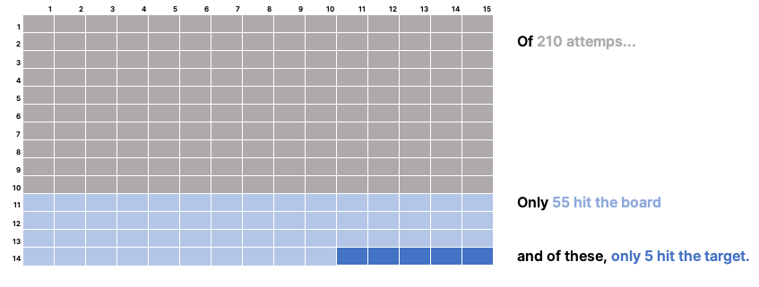
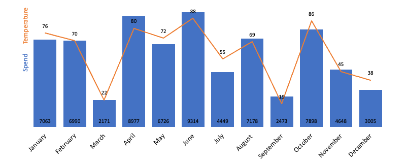
Here are some practices we can follow to improve the readability of this graph:
- Directly label the data, removing the axes, widening the bars and tidying up a bit
- Separate the charts vertically
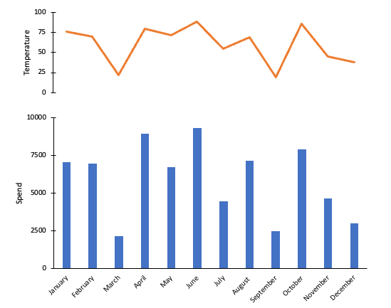
This solution is, in my opinion, the best in terms of clarity.
Presentation targeting and personalization
Now let’s touch on a fundamental point for every storyteller: his/her relationship with the audience.
The ability to communicate effectively is only useful if you are communicating the right thing to the right people. If these two conditions are not met, then the communication becomes inefficient.
The presentation of our data starts from three fundamental questions:
Who is our audience?
What do we want our audience to do or understand?
How can we use the available data to achieve our goals?
The better we know our audience, the more information we will have to better communicate our message.
We avoid defining the public as “investors” or “those interested” — by remaining so generic we risk not being able to communicate effectively with anyone.
The Who
It is important to understand what the relationship is between us and the public. Let’s think about how we will be perceived:
Is this the first time we communicate with them?
Or do we have a relationship already established because we’ve known most of them for quite some time?
Do they consider us experts or do we have to work to convey our credibility?
The What
What should our audience do with the information we want to convey to them? Let us always take the time to answer this question — we always want this to be very clear.
We stimulate conversation through calls to action for the audience.
If we don’t have CTAs, we should create new ones, for example through next steps.
The How
The consistency that we must have in our data visualization work must also be reflected in the presentation and tone of voice.
Are we celebrating a success or are we informing the public of an imminent danger to our health if we do not act on the problem presented?
Avoiding an inconsistent tone of voice is important because it aligns audience expectations with our message.
Defining the who, what and how before presenting our data allows us to plan and tailor our communication approach to maximize the efficiency of our exposure.
This planning is also reflected in the graphs and what they are going to show — a presentation to an audience of industry experts will be very different from the same one but to an inexperienced group of people.
Framework for creating effective visualizations
Let’s sum up what we have covered to create a mental model for data visualization and storytelling. This model will help us create simple and effective visualizations and improve our visual communication.
Let’s make a list of what we’ve covered.
Most charts out there aren’t effective — it’s easy to get it wrong but it’s just as easy to see why
Once we understood why (and therefore having reached awareness), let’s stop and always put ourselves in the observer’s shoes
Let’s analyze what we create on screen — how much information is in our visualization? Is it messy? How does this impact the cognitive load of the observer?
Always choose the simplest, most known and empirically suitable visualization for our data. If we have two variables and we want to highlight the relationship between them, then we choose a scatterplot. If we have a set of categorical variables and a metric, a horizontal bar graph.
Respect the attention of the observer. Attention = Currency. Every moment of focus from the audience is a moment earned by us presenting. If we lose it, it’s our fault, not theirs.
Research our audience before presenting. Know the stakeholders, their knowledge of the subject and details of their background.
Conclusion
To those who read the whole article to the end — a heartfelt thank you for your attention 🙏🏻. A heartfelt thanks also to those who have read little, but still learned something.
We’ve seen how little is understood about data visualization as a discipline in its own right — evidence for this claim can simply be gathered by scouring the internet for any visualization whatsoever.
This is a shame, but also an opportunity, as the world becomes more and more data-driven. A professional who works with data therefore needs to learn an emerging, useful and high-impact skill such as data visualization.
I invite the interested reader to read Knaflic’s Storytelling with Data to learn the details that make data-driven visual communication effective.


