Introduction to PCA in Python with Sklearn, Pandas, and Matplotlib
Learn the intuition behind PCA in Python and Sklearn by transforming a multidimensional dataset into an arbitrary number of dimensions

Data scientist. I write about data science, machine learning and analytics. I also write about career and productivity tips to help you thrive in the field.
As data analysts and scientists, we are often faced with complex challenges due to the growing amount of information available.
It is undeniable that the accumulation of data from various sources has become a constant in our lives. Data scientist or not, everyone practically describes a phenomenon as a collection of variables or attributes.
It is very rare to work on solving an analytical challenge without having to deal with a multidimensional data set — this is especially evident today, where data collection is increasingly automated and technology allows us to acquire information from a wide range of sources, including sensors, IoT devices, social media, online transactions and much more.
But as the complexity of a phenomenon grows, so do the challenges that the data scientist has to face to achieve his or her goals.
These challenges might include…
High dimensionality: Having many columns can lead to high dimensionality problems, which can make models more complex and difficult to interpret.
Noisy data: The automatic collection of data can lead to the presence of errors, missing data, or unreliable data.
Interpretation: High dimensionality means low interpretability — it is difficult to understand what the most influential features are for a certain problem.
Overfitting: Too complex models can suffer from overfitting, i.e. excessive adaptation to training data, with consequent low ability to generalize new data.
Computational resources: The analysis of large and complex datasets often requires significant computational resources. Scalability is an important consideration.
Communication of the results: Explaining the discoveries understandably obtained from a multidimensional dataset is an important challenge, especially when you communicate with non-technical stakeholders.
Multidimensionality in the data science and machine learning
In data science and machine learning, a multidimensional dataset is a collection of organized data that include multiple columns or attributes, each of which represents a characteristic (or feature) of the phenomenon object of study.
A dataset that contains information on houses is a concrete example of a multidimensional dataset. In fact, each house can be described with its square meters, the number of rooms, if there is a garage or not and so on.
In this article, we will explore how to use the PCA to simplify and visualize multidimensional data effectively, making complex multidimensional information accessible.
By following this guide, you will learn:
The intuition behind the PCA algorithm
Apply the PCA with Sklearn on a toy dataset
Use Matplotlib to visualize reduced data
The main use cases of PCA in data science
Let’s get started!
Fundamental intuition of the PCA algorithm
Principal Component Analysis, PCA, is an unsupervised statistical technique for the decomposition of multidimensional data.
Its main purpose is to reduce our multidimensional dataset in a number of arbitrary variables in order to
Select important features in the original dataset
Increase the signal / noise ratio
Create new features to provide to a Machine Learning model
Visualize multidimensional data
Based on the number of components that we choose, the PCA algorithm allows the reduction of the number of variables in the original dataset by preserving those that best explain the total variance of the dataset itself. PCA fights the so infamous curse of dimensionality.
The curse of dimensionality is a concept in machine learning that refers to the difficulty encountered when working with high dimensionality data.
As the number of size increases, the number of data necessary to represent a set of data reliably increases exponentially. This can make it difficult to find interesting patterns in data and can cause overfitting problems in automatic learning models.
The transformation applied by the PCA reduces the size of the dataset by creating components that best explain the variance of the original data. This allows to isolate the most relevant variables and to reduce the complexity of the dataset.
PCA is typically a difficult technique to understand, especially for new practitioners in the field of data science and analytics.
The motivation of this difficulty must be sought in the strictly mathematical bases of the algorithm.
So what does the PCA do from a mathematical point of view?
PCA allows us to project a n-dimensional dataset in a lower dimensional plane.
It seems complex, but in reality it is not. Let’s try with a simple example:
When we draw something on a sheet of paper, we are actually taking a mental representation (which we can represent in 3 dimensions) and projecting it on the sheet. In doing so, we reduce the quality and precision of the representation.
However, the representation on sheet remains understandable and even shareable with our peers.
In fact, during the act of drawing we represent forms, lines and shadows in order to allow the observer to understand what we are thinking about in our brain.
Let’s take this image of a shark as an example:

If we wanted to draw it on a sheet of paper, based on our level of skill (mine is very low as you can see), we could represent it like this:

The point is that despite the representation is not perfectly 1:1, an observer can easily understand that the drawing represents a shark.
In fact, the “mental” algorithm that we used is similar to the PCA — we have reduced the dimensionality, therefore the characteristics of the shark in photography, and used only the most relevant dimensions to communicate the concept of “shark” on the sheet of paper.
Mathematically speaking therefore, we don’t just want to project our object into a lower dimensional plan, but we also want to preserve the most relevant information as possible.
Data compression
We will use a simple dataset to proceed with an example. This dataset contains structural information on houses, such as size in square meters, number of rooms and so on.
The goal here is to show how easy it is to approach the limitations of data visualization when dealing with a multidimensional dataset and how PCA can help us overcome these limitations.
The dimensionality of a dataset can be understood simply as the number of columns within it. A column represents an attribute, a characteristic, of the phenomenon we are studying. The more dimensions there are, the more complex the phenomenon.
In this case we have a dataset with 5 dimensions.
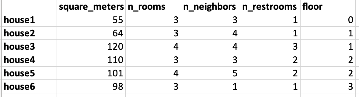
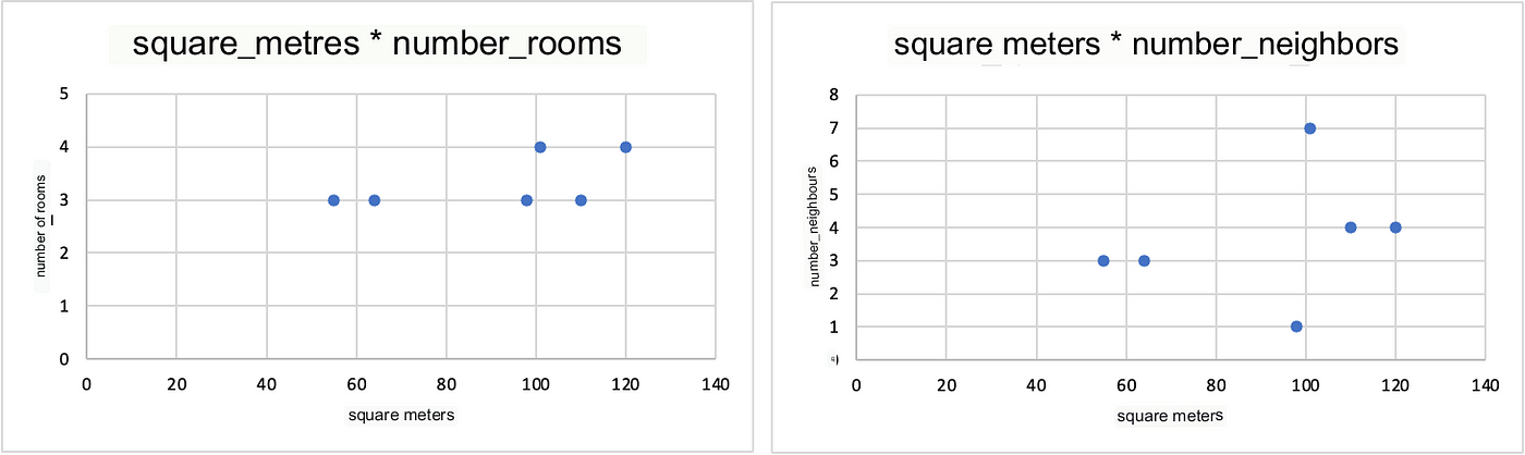
But what are these limitations in the data visualization? Let me explain it to you by analyzing the square_metres variable.
Houses 1 and 2 have a low square_meters values of while all the others are around or higher than 100. This is a one-dimensional graph precisely because we take into consideration only one variable.
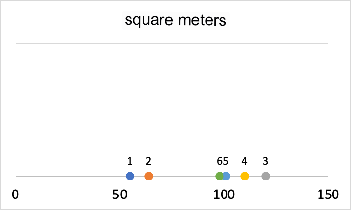
Now let’s add a dimension to the graph.
This type of graph, called a scatterplot, shows the relationship between two variables. It is very useful for visualizing correlations and interactions between variables.
This visualization is already starting to introduce a good level of interpretative complexity, as it requires careful inspection to understand the relationship between the variables even by expert analysts.
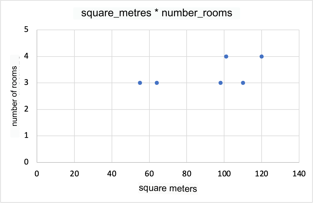
Now let’s go insert yet another variable.
This is definitely a complex image to process. Mathematically though, this is a visualization that makes perfect sense. From a perceptual and interpretative point of view, we are at the limit of human understanding.
We all know how our interpretation of the world stops at the three-dimensional. However, we also know that this dataset is characterized by 5 dimensions.
But how do we view them all?
We can’t, unless we visualize two-dimensional relationships between all the variables, side by side.
In the example below, we see how square_metres are related in two dimensions to n_rooms and n_neighbors.
Now let’s imagine putting all the possible combinations side by side…we would soon be overwhelmed by the large amount of information to keep in mind.
This is where PCA comes into play. Using Python (we’ll see later), we can apply Sklearn’s PCA class to this dataset and obtain such a graph.
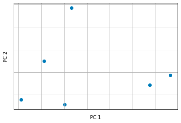
What we see here is a graph showing the principal components returned by the PCA.
In practice, the PCA algorithm performs a linear transformation on the data in order to find the linear combination of features that best explains the total variance of the dataset.
This combination of features is called the principal component. The process is repeated for each major component until the desired number of components is reached.
The advantage of using PCA is that it allows us to reduce the dimensionality of the data by keeping the most important information, eliminating the less relevant ones and making the data easier to visualize and to use to build machine learning models.
If you are interested in digging deeper into the mathematics behind PCA, I suggest the following resources in English:
Python implementation
To apply PCA in Python, we can use scikit-learn, which offers a simple and effective implementation.
At this link you can read the PCA documentation.
We’ll use the wine dataset as toy dataset for the example. The wine dataset is part of Scikit-Learn and under the creative commons license, attribution 4.0, making it free to use and share (license can be read here).
Let’s get started on the essential libraries
# import the required libs
from sklearn.datasets import load_wine
from sklearn.decomposition import PCA
import matplotlib.pyplot as plt

# load the dataset
wine = load_wine()

# convert the object in a pandas dataframe
df = pd.DataFrame(data=wine.data, columns=wine.feature_names)
df["target"] = wine.target
df
>>>
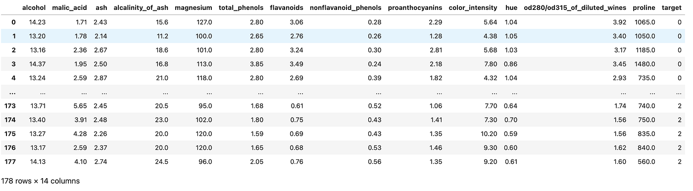
The dimensionality of the data is (178, 14) — it means that there are 178 rows (examples that a machine learning model can learn from) each of them described by 14 dimensions.
We need to apply data normalization before applying PCA. You can do this with Sklearn.
# normalize data
from sklearn.preprocessing import StandardScaler
X_std = StandardScaler().fit_transform(df.drop(columns=["target"]))
It is important to normalize our data when using PCA: it calculates a new projection of the dataset and the new axis is based on the standard deviation of the variables.
We are now ready to reduce the size. We can apply PCA simply like this
# PCA object specifying the number of principal components desired
pca = PCA(n_components=2) # we want to project two dimensions so that we can visualize them!

# We fit the PCA model on standardized data
vecs = pca.fit_transform(X_std)
We can specify any number of PCA output dimensions as long as they are less than 14, which is the total number of dimensions in the original dataset.
Now let’s organize the small version of the dataframe into a new Pandas Dataframe object:
reduced_df = pd.DataFrame(data=vecs, columns=['Principal Component 1', 'Principal Component 2'])
final_df = pd.concat([reduced_df, df[['target']]], axis=1)
final_df
>>>
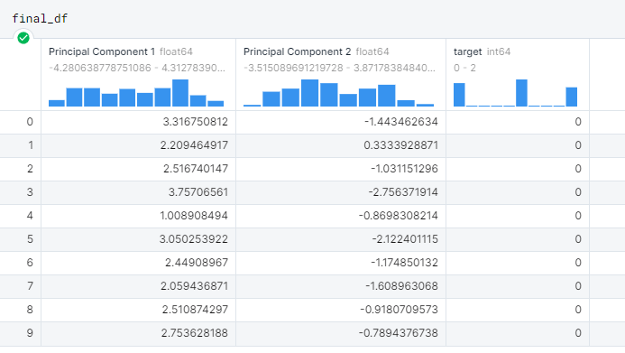
Principal Component 1 and 2 are the output dimensions of the PCA, which will now be possible to visualize with a scatterplot.
plt.figure(figsize=(8, 6)) # set the size of the canvas
targets = list(set(final_df['target'])) # we create a list of possible targets (there are 3)
colors = ['r', 'g', 'b'] # we define a simple list of colors to differentiate the targets

# loop to assign each point to a target and color
for target, color in zip(targets, colors):
     idx = final_df['target'] == target
     plt.scatter(final_df.loc[idx, 'Principal Component 1'], final_df.loc[idx, 'Principal Component 2'], c=color, s=50)

# finally, we show the graph
plt.legend(targets, title="Target", loc='upper right')
plt.xlabel('Principal Component 1')
plt.ylabel('Principal Component 2')
plt.title('PCA on Wine Dataset')
plt.show()
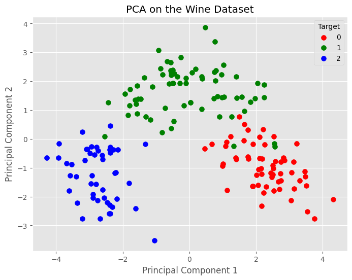
And there it is. This graph shows the difference between the wines described by the 14 initial variables, but reduced to 2 by the PCA. The PCA retained the relevant information and in the meantime reduced the noise in the dataset.
Here is the whole code to apply PCA with Sklearn, Pandas and Matplotlib in Python.
import pandas as pd
from sklearn.decomposition import PCA
import matplotlib.pyplot as plt

wine = load_wine()

df = pd.DataFrame(data=wine.data, columns=wine.feature_names)

df["target"] = wine.target

from sklearn.preprocessing import StandardScaler
X_std = StandardScaler().fit_transform(df.drop(columns=["target"]))

pca = PCA(n_components=2)

vecs = pca.fit_transform(X_std)

reduced_df = pd.DataFrame(data=vecs, columns=['Principal Component 1', 'Principal Component 2'])
final_df = pd.concat([reduced_df, df[['target']]], axis=1)

plt.figure(figsize=(8, 6))
targets = list(set(final_df['target']))
colors = ['r', 'g', 'b']

for target, color in zip(targets, colors):
    idx = final_df['target'] == target
    plt.scatter(final_df.loc[idx, 'Principal Component 1'], final_df.loc[idx, 'Principal Component 2'], c=color, s=50)

plt.legend(targets, title="Target", loc='upper right')
plt.xlabel('Principal Component 1')
plt.ylabel('Principal Component 2')
plt.title('PCA on the Wine Dataset')
plt.show()
Use cases for PCA
Below is a list of the most common PCA use cases in data science.
Improve machine learning model training speeds
The data compressed by the PCA provides the important information and is much more digestible by a machine learning model, which now bases its learning on a small number of features instead of all the features present in the original dataset.
Feature selection
PCA is essentially a feature selection tool. When we go to apply it, we look for the features that explain the dataset variance best.
We can create a ranking of the principal components and sort them by importance, with the first component explaining the most variance and the last component explaining the least.
By analyzing the main components it is possible to go back to the original features and exclude those that do not contribute to preserving the information in the reduced dimensional plan created by the PCA.
Anomaly detection
PCA is often used in anomaly identification because it can help identify patterns in the data that are not easily discerned with the naked eye.
Anomalies often appear as data points away from the main group in lower dimensional space, making them easier to detect.
Signal detection
In contrast to anomaly identification, PCA is also very useful for signal detection.
Indeed, just as PCA can highlight outliers, it can also remove the “noise” that does not contribute to the total variability of the data. In the context of speech recognition, this allows the user to better isolate speech traces and to improve speech-based person identification systems.
Image compression
Working with images can be expensive if we have particular constraints, such as saving the image in a certain format. Without going into detail, PCA can be useful for compressing images while still maintaining the information present in them.
This allows machine learning algorithms to train faster at the expense of compressed information of a certain quality.
Conclusions
Thank you for your attention 🙏 I hope you enjoyed reading and learned something new.
To recap,
you learned what dimensionality of a dataset means and the limitations that come with having many dimensions
you learned how the PCA algorithm works intuitively step by step
you learned how to implement it in Python with Sklearn
and finally, you learned about the most common PCA use cases in data science
If you found this article useful, share it with your passionate friends or colleagues.
Until next time,
Andrew


